df = sns.load_dataset('tips')
df.shape
(244, 7)df = sns.load_dataset('tips')
df.shape(244, 7)df.head()| total_bill | tip | sex | smoker | day | time | size | |
|---|---|---|---|---|---|---|---|
| 0 | 16.99 | 1.01 | Female | No | Sun | Dinner | 2 |
| 1 | 10.34 | 1.66 | Male | No | Sun | Dinner | 3 |
| 2 | 21.01 | 3.50 | Male | No | Sun | Dinner | 3 |
| 3 | 23.68 | 3.31 | Male | No | Sun | Dinner | 2 |
| 4 | 24.59 | 3.61 | Female | No | Sun | Dinner | 4 |
def set_sns(
    dpi:int=300
)->None:
Set seaborn defaults for notebook display and saved figures.
set_sns(dpi=50)
def save_svg(
    path:str | pathlib.Path
)->None:
Save the current matplotlib figure as SVG with editable text.
plt.figure()
plt.plot([0, 1], [0, 1])
# save_svg(Path('nbs') / '_tmp_utils.svg')
def save_pdf(
    path:str | pathlib.Path
)->None:
Save the current matplotlib figure as PDF with TrueType fonts.
plt.figure()
plt.plot([0, 1], [1, 0])
# save_pdf(Path('nbs') / '_tmp_utils.pdf')
def save_show(
    path:str | pathlib.Path | None=None, # output path when saving instead of showing
    show_only:bool=False, # force plt.show even when no path is provided
)->None:
Show the current figure or save it, then close open figures.
plt.figure()
plt.plot([0, 1], [0.5, 0.5])
# save_show(path=Path('nbs') / '_tmp_utils_show.png')
def get_color_dict(
    categories:list, # labels that need colors
    palette:str='tab20', # seaborn palette name
)->dict:
Assign colors to labels while tolerating duplicate category names.
get_color_dict(['A', 'B', 'C'], palette='Set2'){'A': (0.4, 0.7607843137254902, 0.6470588235294118),
'B': (0.9882352941176471, 0.5529411764705883, 0.3843137254901961),
'C': (0.5529411764705883, 0.6274509803921569, 0.796078431372549)}
def get_plt_color(
    palette:dict | list | str, # dict lookup, explicit list, or palette name
    columns:list, # plotted column names in output order
)->list:
Return colors in plotting order for a dict, list, or named palette.
get_plt_color('Set2', ['a', 'b'])
def get_hue_big(
    df:DataFrame, # source dataframe
    hue_col:str, # categorical column used for hue
    cnt_thr:int=10, # minimum count retained in the filtered hue series
)->Series:
Filter a hue column down to categories that meet a count threshold.
# get_hue_big(df, 'day', cnt_thr=40).tolist()
def add_stats(
    ax, df, value, group, test:str='t-test_ind', loc:str='inside', text_format:str='star', min_n:int=3,
    kwargs:VAR_KEYWORD
):
If value is str: compare between groups (x=group, y=value) If value is list/tuple: compare among values within each group (x=group, hue=‘variable’)
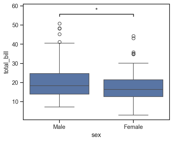
fig, ax = plt.subplots(figsize=(5, 4))
sns.boxplot(data=df, x='sex', y='total_bill', ax=ax)
add_stats(ax, df, value='total_bill', group='sex')