# Load data for testing
from katlas.data import *
from katlas.utils import *
from katlas.pssm import *plot
plot functions of probability pssm
Setup
df=Data.cddm()
pssm_df = recover_pssm(df.loc['AKT1'])
Heatmap
It will convert s,t,y to pS,pT,pY in the heatmap.
plot_heatmap
def plot_heatmap(
    heatmap_df, ax:NoneType=None, position_label:bool=True, figsize:tuple=(5, 6), include_zero:bool=True,
    scale_pos_neg:bool=False, colorbar_title:str='Prob.', vmin:NoneType=None, vmax:NoneType=None, cmap:NoneType=None,
    center:NoneType=None, robust:bool=False, annot:NoneType=None, fmt:str='.2g', annot_kws:NoneType=None,
    linewidths:int=0, linecolor:str='white', cbar:bool=True, cbar_kws:NoneType=None, cbar_ax:NoneType=None,
    square:bool=False, xticklabels:str='auto', yticklabels:str='auto', mask:NoneType=None
):
Plot a heatmap of pssm.
This function visualizes a PSSM or log-odds matrix as a heatmap with diverging color scales centered at 0.
Color scale behavior:
By default (
scale_pos_neg=False), the colormap is centered at 0, but the full data range determines the color intensity:\[ \text{color range} = [\min(\text{data}), \max(\text{data})], \quad \text{with center at } 0 \]
This is useful when you want to emphasize whether values are above or below zero, but without enforcing symmetry.
If
scale_pos_neg=True, the function uses a balanced diverging scale viaTwoSlopeNorm, such that:\[ \text{min color} = \min(\text{data}), \quad \text{center} = 0, \quad \text{max color} = \max(\text{data}) \]
The positive and negative ranges are scaled separately, ensuring that both ends of the heatmap have equal visual weight — especially helpful for symmetric data like log-odds matrices.
Additional visual features: - The center position (\(i = 0\)) can be masked out using include_zero=False.
plot_heatmap(pssm_df-0.3,scale_pos_neg=False,figsize=(15, 6));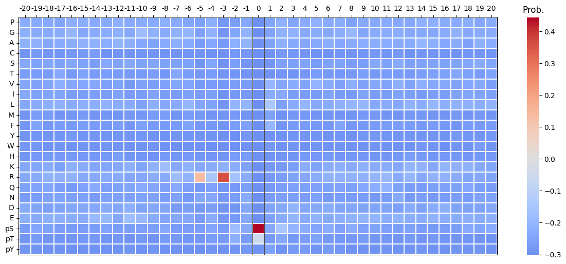
plot_heatmap(pssm_df-0.3,scale_pos_neg=True,figsize=(15, 6));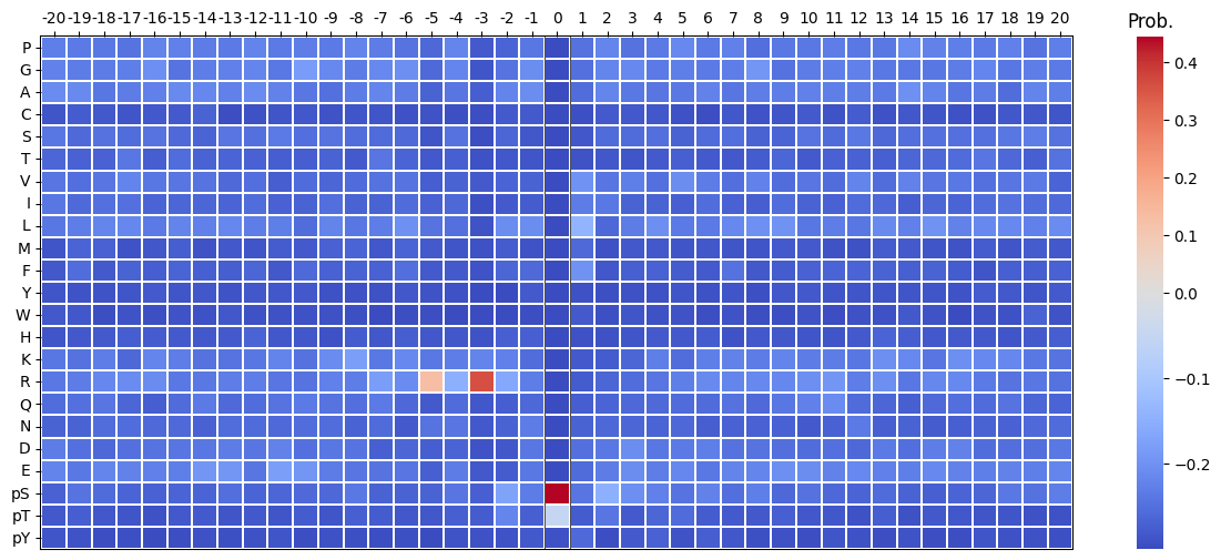
plt.close('all')Two heatmaps comparison
plot_two_heatmaps
def plot_two_heatmaps(
    pssm1, pssm2, kinase_name:str='Kinase', title1:str='CDDM', title2:str='PSPA', figsize:tuple=(4, 4.5),
    cbar:bool=True, scale_01:bool=False, cbar_fontsize:int=10, kwargs:VAR_KEYWORD
):
Plot two side-by-side heatmaps with black rectangle borders, titles on top, shared kinase label below, and only left plot showing y-axis labels.
pssm_df2 = pssm_df.loc[:,-5:5]plot_two_heatmaps(pssm_df2,pssm_df2,'AKT','AKT1','AKT2')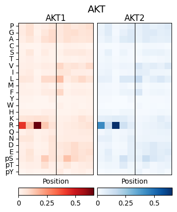
Logo motif
To distinguish sty from STY, sty (lowercase) in the input df are automatically converted to pS,pT,pY in logo motif.
plot_logo_raw
def plot_logo_raw(
    pssm_df, ax:NoneType=None, title:str='Motif', ytitle:str='Bits', figsize:tuple=(10, 2)
):
Plot logo motif using Logomaker.
plot_logo_raw(pssm_df)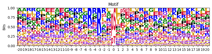
We can find the center name is in lower case, so need to change them
change_center_name
def change_center_name(
    df
):
Transfer the middle s,t,y to S,T,Y for plot if s,t,y have values; otherwise keep the original.
Now instead of s,t,y, the center name becomes S, T and Y:
change_center_name(pssm_df)[0]aa
P 0.000000
G 0.000000
A 0.000000
C 0.000000
S 0.744152
T 0.248538
V 0.000000
I 0.000000
L 0.000000
M 0.000000
F 0.000000
Y 0.007310
W 0.000000
H 0.000000
K 0.000000
R 0.000000
Q 0.000000
N 0.000000
D 0.000000
E 0.000000
s 0.000000
t 0.000000
y 0.000000
Name: 0, dtype: float64get_pos_min_max
def get_pos_min_max(
    pssm_df
):
Get min and max value of sum of positive and negative values across each position.
scale_zero_position
def scale_zero_position(
    pssm_df
):
Scale position 0 so that: - Positive values match the max positive column sum of other positions - Negative values match the min (most negative) column sum of other positions
This function rescales position 0 in a log-odds PSSM so that its total positive and negative stack heights match those of the most extreme positions on either side.
This ensures the central position visually matches the dynamic range of surrounding positions in log-odds logo plots.
scale_pos_neg_values
def scale_pos_neg_values(
    pssm_df
):
Globally scale all positive values by max positive column sum, and negative values by min negative column sum (preserving sign).
convert_logo_df
def convert_logo_df(
    pssm_df, scale_zero:bool=True, scale_pos_neg:bool=False
):
Change center name from s,t,y to S, T, Y in a pssm and scaled zero position to the max of neigbors.
get_logo_IC
def get_logo_IC(
    pssm_df
):
For plotting purpose, calculate the scaled information content (bits) from a frequency matrix, using log2(3) for the middle position and log2(len(pssm_df)) for others.
To visualize the motif using Logomaker, the scaled PSSM is computed by weighting each amino acid’s frequency at position \(i\) by the position’s information content:
\[ \text{PSSM\_scaled}_i(x) = P_i(x) \cdot \mathrm{IC}_i \]
This results in a matrix where the total stack height at each position equals the information content, and each letter’s height is proportional to its contribution. This is the standard format used by Logomaker to generate sequence logos.
get_logo_IC(pssm_df)| Position | -20 | -19 | -18 | -17 | -16 | -15 | -14 | -13 | -12 | -11 | ... | 11 | 12 | 13 | 14 | 15 | 16 | 17 | 18 | 19 | 20 |
|---|---|---|---|---|---|---|---|---|---|---|---|---|---|---|---|---|---|---|---|---|---|
| aa | |||||||||||||||||||||
| P | 0.019253 | 0.011378 | 0.016632 | 0.014723 | 0.027341 | 0.017469 | 0.018061 | 0.020054 | 0.018999 | 0.021432 | ... | 0.022264 | 0.016570 | 0.017585 | 0.025658 | 0.024024 | 0.024794 | 0.016453 | 0.018620 | 0.011564 | 0.017775 |
| G | 0.020457 | 0.011642 | 0.018254 | 0.019222 | 0.033016 | 0.012927 | 0.018462 | 0.023318 | 0.019358 | 0.020458 | ... | 0.023748 | 0.019803 | 0.018025 | 0.017396 | 0.018739 | 0.023716 | 0.020762 | 0.014741 | 0.014455 | 0.016590 |
| A | 0.023666 | 0.015347 | 0.015820 | 0.018404 | 0.025278 | 0.020613 | 0.022074 | 0.022852 | 0.021867 | 0.025329 | ... | 0.023748 | 0.018186 | 0.018904 | 0.027833 | 0.024505 | 0.019943 | 0.017237 | 0.011637 | 0.016383 | 0.018170 |
| C | 0.003209 | 0.003704 | 0.004462 | 0.003272 | 0.006191 | 0.004891 | 0.008428 | 0.000933 | 0.002151 | 0.003897 | ... | 0.003463 | 0.005658 | 0.002198 | 0.004349 | 0.003844 | 0.003234 | 0.001959 | 0.003879 | 0.003212 | 0.003160 |
| S | 0.016044 | 0.007144 | 0.014198 | 0.012678 | 0.019087 | 0.009782 | 0.008830 | 0.018188 | 0.012188 | 0.020945 | ... | 0.013853 | 0.016570 | 0.011431 | 0.013916 | 0.015376 | 0.017248 | 0.012928 | 0.014741 | 0.014134 | 0.013430 |
| T | 0.009627 | 0.005292 | 0.007707 | 0.016359 | 0.008254 | 0.010830 | 0.008428 | 0.010726 | 0.007170 | 0.008281 | ... | 0.009400 | 0.008083 | 0.007474 | 0.010437 | 0.012012 | 0.015092 | 0.014495 | 0.009698 | 0.005782 | 0.013035 |
| V | 0.015242 | 0.008467 | 0.015415 | 0.021267 | 0.020635 | 0.013276 | 0.014850 | 0.012592 | 0.011471 | 0.007793 | ... | 0.014843 | 0.020611 | 0.013189 | 0.021744 | 0.018258 | 0.022099 | 0.012536 | 0.014353 | 0.013170 | 0.008690 |
| I | 0.015643 | 0.007144 | 0.013792 | 0.013496 | 0.011865 | 0.008734 | 0.010034 | 0.010260 | 0.011113 | 0.009742 | ... | 0.009400 | 0.011720 | 0.011431 | 0.006958 | 0.011532 | 0.011858 | 0.011752 | 0.013189 | 0.009637 | 0.010665 |
| L | 0.016044 | 0.012171 | 0.021905 | 0.022494 | 0.022183 | 0.018517 | 0.020067 | 0.026116 | 0.016848 | 0.023867 | ... | 0.022759 | 0.016166 | 0.025059 | 0.020875 | 0.030751 | 0.026950 | 0.021546 | 0.021335 | 0.015098 | 0.022910 |
| M | 0.003209 | 0.006086 | 0.007707 | 0.002863 | 0.005159 | 0.005590 | 0.002809 | 0.005130 | 0.003226 | 0.007306 | ... | 0.003463 | 0.002425 | 0.006155 | 0.005654 | 0.004324 | 0.003773 | 0.005876 | 0.003491 | 0.004818 | 0.004345 |
| F | 0.004412 | 0.008202 | 0.005679 | 0.008589 | 0.008254 | 0.007686 | 0.007224 | 0.007462 | 0.008962 | 0.005845 | ... | 0.010885 | 0.009295 | 0.008793 | 0.007393 | 0.009610 | 0.007546 | 0.003526 | 0.006594 | 0.005140 | 0.007505 |
| Y | 0.003209 | 0.001852 | 0.002840 | 0.003272 | 0.007222 | 0.002795 | 0.004013 | 0.003265 | 0.003943 | 0.004871 | ... | 0.004453 | 0.003637 | 0.003517 | 0.003479 | 0.003844 | 0.003773 | 0.005484 | 0.004267 | 0.002570 | 0.005135 |
| W | 0.004813 | 0.002646 | 0.001217 | 0.002863 | 0.002064 | 0.002446 | 0.002408 | 0.004664 | 0.002151 | 0.002435 | ... | 0.001484 | 0.002021 | 0.002198 | 0.005219 | 0.003363 | 0.000539 | 0.002742 | 0.002327 | 0.006425 | 0.002765 |
| H | 0.003610 | 0.003175 | 0.005679 | 0.006544 | 0.007738 | 0.004542 | 0.004816 | 0.006529 | 0.008245 | 0.005358 | ... | 0.003958 | 0.005254 | 0.009672 | 0.006958 | 0.005285 | 0.007007 | 0.004701 | 0.003491 | 0.004176 | 0.006320 |
| K | 0.015643 | 0.009261 | 0.018660 | 0.010633 | 0.027857 | 0.016420 | 0.014449 | 0.017255 | 0.014339 | 0.025816 | ... | 0.021769 | 0.015762 | 0.027257 | 0.024354 | 0.017778 | 0.033418 | 0.021546 | 0.020947 | 0.012849 | 0.013825 |
| R | 0.016446 | 0.011642 | 0.022311 | 0.024539 | 0.030953 | 0.014324 | 0.016857 | 0.021453 | 0.016490 | 0.018996 | ... | 0.035127 | 0.018186 | 0.027257 | 0.016961 | 0.025946 | 0.030184 | 0.016453 | 0.013577 | 0.012207 | 0.013035 |
| Q | 0.012033 | 0.008996 | 0.015415 | 0.009815 | 0.008770 | 0.010132 | 0.017258 | 0.012592 | 0.010754 | 0.018022 | ... | 0.029685 | 0.011720 | 0.010551 | 0.007828 | 0.012493 | 0.016709 | 0.010969 | 0.013965 | 0.007709 | 0.008295 |
| N | 0.008423 | 0.005557 | 0.012575 | 0.012269 | 0.013929 | 0.009782 | 0.008027 | 0.013991 | 0.010396 | 0.013151 | ... | 0.009895 | 0.016974 | 0.007474 | 0.009133 | 0.006727 | 0.009702 | 0.008227 | 0.007370 | 0.008673 | 0.011060 |
| D | 0.017649 | 0.008996 | 0.010547 | 0.013496 | 0.019087 | 0.013276 | 0.016054 | 0.020986 | 0.013622 | 0.025329 | ... | 0.016327 | 0.010508 | 0.018465 | 0.013916 | 0.021622 | 0.026950 | 0.011361 | 0.012025 | 0.009958 | 0.015405 |
| E | 0.020858 | 0.010848 | 0.021905 | 0.020858 | 0.025794 | 0.016770 | 0.028897 | 0.033578 | 0.013622 | 0.039941 | ... | 0.024738 | 0.023036 | 0.021103 | 0.020440 | 0.026907 | 0.026411 | 0.018020 | 0.019395 | 0.014776 | 0.020145 |
| s | 0.008022 | 0.009790 | 0.011764 | 0.009407 | 0.010318 | 0.008036 | 0.009231 | 0.014924 | 0.008245 | 0.012177 | ... | 0.012864 | 0.009295 | 0.012310 | 0.008698 | 0.008168 | 0.011858 | 0.009010 | 0.015904 | 0.010922 | 0.017380 |
| t | 0.004412 | 0.004234 | 0.004057 | 0.003681 | 0.003095 | 0.004192 | 0.005218 | 0.003731 | 0.004302 | 0.003897 | ... | 0.004948 | 0.002425 | 0.007034 | 0.002609 | 0.005766 | 0.005390 | 0.003526 | 0.003491 | 0.001927 | 0.001975 |
| y | 0.003209 | 0.001852 | 0.000811 | 0.001636 | 0.000000 | 0.000699 | 0.002007 | 0.001865 | 0.001792 | 0.003897 | ... | 0.004453 | 0.002021 | 0.001319 | 0.003044 | 0.001441 | 0.001617 | 0.003134 | 0.002327 | 0.001927 | 0.001185 |
23 rows × 41 columns
plot_logo
def plot_logo(
    pssm_df, title:str='Motif', scale_zero:bool=True, ax:NoneType=None, figsize:tuple=(10, 1)
):
Plot logo of information content given a frequency PSSM.
# plot_logo(pssm_df,scale_zero=False,figsize=(10,1))Set scale_zero to default True can have better vision of the side amino acids
plot_logo(pssm_df,title='Motif',figsize=(10,1))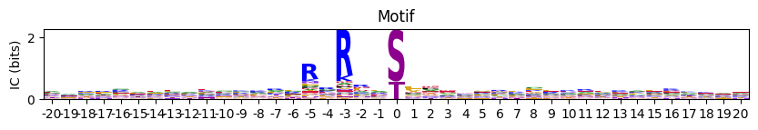
plt.close('all')Multiple logos
As multiple figures:
plot_logos_idx
def plot_logos_idx(
    pssms_df, idxs:VAR_POSITIONAL, figsize:tuple=(14, 1)
):
Plot logos of a dataframe with flattened PSSMs with index ad IDs.
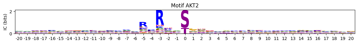
pssms=Data.cddm()plot_logos_idx(pssms,'AKT1','AKT2')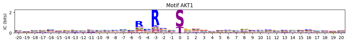
In one figure:
plot_logos
def plot_logos(
    pssms_df, count_dict:NoneType=None, # used to display n in motif title
    prefix:str='Motif', figsize:tuple=(14, 1)
):
Plot all logos from a dataframe of flattened PSSMs as subplots in a single figure.
plot_logos(pssms.head(2),prefix=None)
plt.close('all')Logo motif + Heatmap
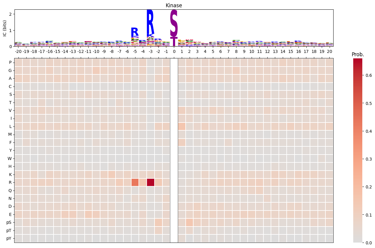
plot_logo_heatmap
def plot_logo_heatmap(
    pssm_df, # column is position, index is aa
    title:str='Motif', figsize:tuple=(17, 10), include_zero:bool=False
):
Plot logo and heatmap vertically
plot_logo_heatmap(pssm_df,title='Kinase',figsize=(17,10))